My first storyboard consisted of a story of the beginning of the fight. Then it leads into a flashback when the medal hits twin 1 they relive the past where success pulls them away from twin 2 so both start to grow distant from one another. They awaken to twin 2 walking towards them after a nasty fall only to get back up to get revenge on twin 2 sniping twin 1 out of the sky. This was already a 50 second storyboard so it was in desperate need to be shortened and condensed right from the start. This also did not show the whole complete storyline either.
Up till this point I had been doing story-boards in Photoshop. However, if I have learnt anything in this project it was how inefficient I was being with doing this. This is because drawing out each frame in a very small window and having to edit this into an animatic after is a massive time loss when creating animation in a short amount of time. I realised this far too late and decided to use storyboard pro too far into the project losing a lot of time I could of used in other aspects of this project. I now know that in the future storyboard pro is a better tool to aid me in creating quicker and much more dynamic storyboards/Animatic in the future.
The story beats itself on the top right showed me how long my current version of the story truly was since I could not fit the entire story in 6 parts. Because of this discovery I am glad to have pivoted to shortening my story at that time. This shows my initiative and problem solving even with a story that is very close to my heart.
When I look at the first Storyboard on the top left I can see the lack of direction it has. The beginning is void of meaning since we had no idea why they were fighting and the flashbacks are followed after even though we do not know much about the characters themselves. If I were to do this again I would have continued to do story beat sheets till I have one that works then continue with a storyboard since it was clear in this one that I had not fully decided on how the story was going to happen in visual form.
New Storyboard Versions
My overall thoughts is that I did not step back enough to look at the over arching story. Only towards the end did I sit myself down to think about this. There was a period of time where I confused myself by trying to respect and follow my tutors advice. However, due to this I forgot what the plan for this film truly was and got lost trying to change individual parts of the film rather than making it cohesive together the entire time.
I am grateful for the advice my tutors gave me since it taught me to keep thinking of key parts of my film. Such as establishing shots, wide shots how to transition from one frame to another. Consistency within a scene making sure both characters are consistent to the camera. I also learnt a key lesson from tutors which is that in the end of the day the film is made by me meaning even if the story is a bit confusing in the end it is my story and as long as I believe it tells it correctly it is the right way to do the story justice. I got too caught up in pleasing others I forgot that the film was meant to be a homage to my sister. In the future I will stick to my beliefs in my film and make sure I keep reminding myself what it stands for and what it is meant to be like.
The final storyline revision I made in text form (still did not become the final revision I made):
Beginning
- two people fighting
- one wins the battle and the other sulks,
Middle
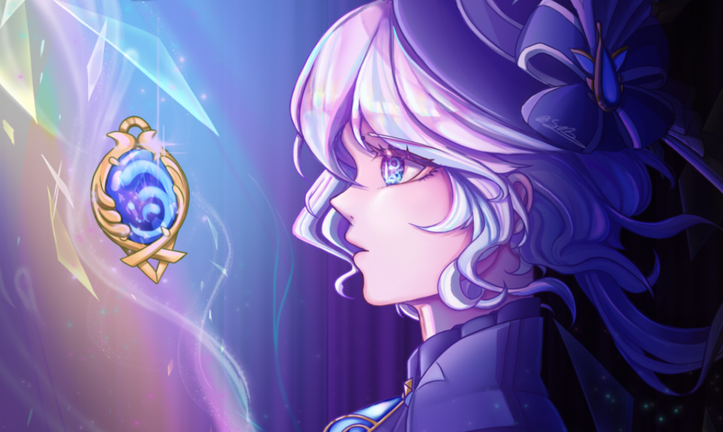
- the other gives the gem to the other
- creates a monster out of it
- It attacks the sister
- but the other sister runs in to defend and creates a forcefield
End
- she ends up sharing half the power taking it out of herself and handing it to the other grabbing her arm to stand up
- both face off the new monster ahead
Storyboard Critiques from 1-8
Story-board one
What was good about it?
The beginning is striking with a far away shot to establish the characters. The fight scene is dynamic with lots of back and forth to show resistance from both party members. The use of differing colours splits the characters and makes it easier to see what is happening in a scene.
What needed improving?
There are not enough expanded shots. There are far too many close up shots and too many middle shots, this makes it difficult to continue establishing the environment and where the characters stand on it for the rest of the film. The storyboard is not complete.
If I did this again what should I have done better?
I should have done some background concept art before this to establish a setting for the characters to interact with so it is not so difficult to establish where the characters stand in the scene.
Story-board two
What was good about it?
More dynamic shots were added, replacing shots that were too flat for how dramatic the scene was meant to be. For example the starting shot being closer up and at a more dynamic angle makes you feel the importance of the object in the distance much more than beforehand. I also use the stage much better with the creature falling off and flying out of frame adding more motion to a still scene.
What needed improving?
The last shot is not dynamic enough for being the last shot. The action seems to go from being strong to stopping and then ramping up again there is not a clear beginning middle or end.
If I did this again what should I have done better?
Again I should have some backgrounds down to make sure I can base the animation off of it. I also should have considered the story beats in this early stage and corrected the irregular story ups and downs this story line was conveying at this point in time.
Story-board Three
What was good about it?
Much more dynamic ending with a bottom up shot to show the looming threat of the enemy above them. I improved slightly by adding a huge wide shot where it shows the impactful attack hitting the green twin.
What needed improving?
The ending is very confusing since it comes from an stone that wasn’t established at all early on that it could be broken. This was pointed out to be my a tutor as well as too many symbolisms made the whole story too confusing.
If I did this again what should I have done better?
I needed to at this point stop and figure out what I wanted to tell with this story. This is where I lost myself and kept making small corrections to this existing story but by doing this I don’t fix the overarching issue of a fragmented story-line that doesn’t tell a full picture. Next project I will keep a hold of the story and make sure it makes sense throughout the whole storyboard process.
Story-board Four
What was good about it?
Took out the confusing symbolisms and replaced it with more Twin Themes
What needed improving?
The symbolisms replacing it are still confusing and doesn’t add much more to the shot and could have been done without it.
If I did this again what should I have done better?
I would have taken out the stone breaking scene since it takes up to a third of the animation and it is not adding that much other than just showing a display of power. There are many ways to show a display of power being transferred and the way I show it in the end is much better than the one I use here.
Story-board Five
What was good about it?
I finally took out all of the symbolisms that were not working and replaced the ending with a much more cohesive and shorter conclusion. By transferring it by the arm it shows the actual symbol of Unity which is grabbing someone’s hand but also shows them willing to fight together despite the differences at the start. I finally added another establishing shot of the monster in its pure scale to the twins. This is an incredible shot displaying the true power of the monster and its capabilities.
What needed improving?
The story is still confusing in the centre because of the resolution of the fight ending with one twin getting the jewel then the ramp up of another fight feels unneeded and not well earned to the viewer.
If I did this again what should I have done better?
I should have adjusted the middle to suit the ending better. Because, the monster is created from the jewel it should be presented earlier to set up this monster conflict so that the monster creation is not so out of the blue for the viewer.
Story-board Six
What was good about it?
I took the critiques from my tutor and reworked the middle part. This was the part where I sat myself down and re wrote out the story to make sure it was a story I wanted to tell. I extended the fight from the previous storyboard and instead of the monster being created by the stone it is made by the twin out of pain and taking over the twin over their sadness.
What needed improving?
The middle is better than before yet still doesn’t make complete sense. The monster taking the twin over makes it difficult to justify the same twin from saving the one later with the force field. I should not have added the monster controlling her since it is conflicting with the ending which is already established from the previous story board.
If I did this again what should I have done better?
Although I had sat down and thought of a stronger story line I did not plan out the progression and therefore the middle not matching the end continues to be a difficultly in this animation itself. I should have stepped back even further to see this but at the time I was oblivious to this fact still.
Story-board Seven
What was good about it?
This is where I finally got some backgrounds implanted into the storyboards. These showed the environment very well helping to envision how this whole animation will finally look at the end.
What needed improving?
The previous improvements had not been added because I knew I was running too low on time to change things. However, it is never too late to change this story since I can still continue this after the deadline and animating a storyline that does not make sense is not good to keep in my portfolio so I should stick to my idea and change this storyboard at this time.
If I did this again what should I have done better?
Been far quicker with changing the story line since at this point in time I should have started animating and having an unfinished and fragmented story put me in a bad place when thinking of how I was going to complete this for the deadline. In short this process of changing small details of the storyboard caused this push back in time loss and therefore is the reason this animation is not completed for the deadline.
Story-board Eight
What was good about it?
From my last story board I finally understood that I needed the beginning middle and end to be in sync with each other so, I scrapped the part where the monster takes over and replaced it with more character bickering in a more playful way. I was told in critique by many of my tutors that there was not enough character acting and that the characters barely got time to show who they really are compared to the rest of the film which was too much fighting so in the last efforts of creating a film I want to represent me well I decided to add character acting in the last change of the animatic to show more of what the characters stand for.
What needed improving?
The gem being taken by the monster makes sense but now the gem slots in the centre of the twins isn’t so obvious now. To counter-act this in the film I may have them light up in the end to show they didn’t need the gem to make their souls light up it was each other.
If I did this again what should I have done better?
Even though it took me seven storyboards to finally understand I am glad I learnt the lesson of story progression. Up to this point I was micro changing the story but I needed to see the bigger picture to realise the stories true plot holes which made it easier to edit in the end to a more cohesive film.