Critiquing the Final colour choices
Twin 1 is more balanced than before. This is shown in the grayscale as the darker parts are sandwiched by the lighter parts. This is the exact same for the other twin showing the similarities in their colour choices.
Twin 1’s colours all stand out from one another none mix into one another making it a good colour scheme overall. The brightest colour being their skin helps to bring your eyes to their face and arm . Their arm helping to point out the asymmetry in the character design very well.
The only thing I would Improve on is the lack of a secondary colour. There is only green in this design except for the eyes which have a baby blue in them but this design being predominantly green does work but a secondary colour that compliments the green can help the green stand out even more. An example is adding turquoise in the colour scheme. This is because it is a mix of both of the twins colours and shows they are related somehow with colour schemes alone.
Twin 2 is the same but instead the centre of the character is the darkest then radiates out into lighter colours. Being sandwiched by her skin tone shows a very even balance within the character this is complimented by the symmetry throughout the entire colour scheme. There is no colour that is not mirrored on both sides making the character feel very stabilised compared to the chaos of Twin 1.
This character does have turquoise elements in the hair and tail part of her dress which could be easily added to the other character t o show a sense of relation with each other. This character also has that secondary colour I was looking for in Twin 1 with a slight yellow at the neck. To improve this colour scheme I should have extended that yellow to some other part of the design to balance it out more and bring other colours to the design since it is still heavily only one colour which is blue.
Overall both really solid colour schemes. If I were to do this again I would continue to use this greyscale look to help discern if the colours stand out from each other or not since values are important to help to separate each part of the character and make each part recognisable from afar.
Critiquing the Final Designs
The design itself of twin 1Is a great combination of tech-wear simplified to become easier to animate while still being a recognisable character design. The strong asymmetry of this character mirrors the other twin really well as the asymmetry follows throughout the entire design. Starting from the hair, to the arms and hands it shows the characters rougher style compared to the other twins. The angular shapes in the design lends to this more even reflecting in their eye shape . It is consistent within the character showing their overall strong and mysterious demeanour. In animation terms this design is not to difficult when being replicated however, due to the asymmetry this means there are more elements to worry about and that cannot be kept easily consistent compared to a symmetrical character could. They also have a drape which can move in a lot of ways causing it to be a bit of a challenge when animating it in mid-air. These are challenges in the design but they do not make this design impossible. If I were to attempt this type of design again I would focus more on shape language since the drape covers the top half it doesn’t leave much room to express large movements since the character is mostly cloaked, much like the large movements I drew up in my early concept phases.
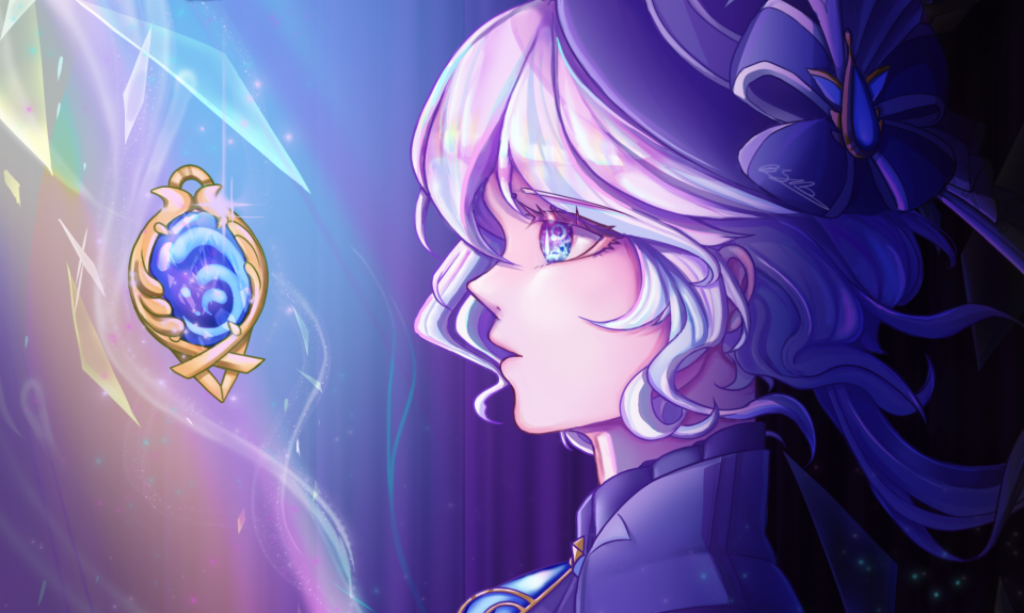
Speaking of the other twin their style is far more symmetrical and elegant since they have much more free flowing aspects In the sleeves and dress respectively. In turn they are much more friendly and open looking showing that contrast I wanted between the two characters. One way these designs do match is in the placement of the colours. With both having a darker inside and a lighter outer part of their design. This makes the audience focus more on the core middle part with the outer parts of the character being more of accessories or add-ons to their design. Also shows they are fundamentally the same since they are sisters but outside they are different looking in every other possible way. Another way they match is in the hair colours being the opposite from each other. With twin 1 being lighter above and darker below and vis versa for the other twin. The last element that is meant to tie them together is their gems at their centre. They are represented of their hearts and at the start is empty only to light up at the end once their relationship is mended into a stronger one.
Overall very good designs however, they do not look similar enough without context to look like sisters. This was a massive mistake on my part since I showed these designs to my sound person (Hanifa Uddin) who are not aware they are sisters explained they looked as if they are a party of friends arguing over some jewel. I fixed the dynamic in the storyboard to showcase more of the sibling type of relationship but what could have I done in the design?
Typically when characters are siblings they share some sort of family trait. But since these characters are mean to be opposites I focused too much on making them different that they do not look similar anymore. If I were to change these designs to be more sibling like I would add a universal design trait to both. An example could be a necklace of some sort.. A friendship bracelet or necklace since me and my sister own matching necklaces this could show they are close in some way. In looks themselves I should have taken something from the kids version which is the heterochromia look. By having one brown eye and one coloured shows they have the same starting roots but have changed overtime to be different.
Simplifying the Designs (from beforehand)
The designs here was the final designs until I was not satisfied with them anymore. Here are the reasons why.
The first twin needed to be simplified still. The only aspect I wanted to remove is the straps in the centre. They do nothing for the overall silhouette and is just another element to worry about to keep consistently in the animation process. The only reason I wanted to keep this element is because straps are notoriously used in tech-wear therefore I wanted to keep this in the design. But the animation process is a lengthy one so to save me some time I cut it out of the design. I also decided I needed to complete the other side profile on this character sheet. It is because this character is asymmetrical and therefore would really benefit from having both sides at my disposal to reference from.
The second twin is far too complicated for hand-drawn 2d animation. Firstly the dress is split in too many parts and is overly complicated from the side profile. The way to fix this is to join the dress together and fake those other splits with just lines going down the dress to make this easier to animate in the end. Simplify the side profile significantly by getting rid of the many sections and making them all connect into one. The rest of the design is okay although still a bit difficult to re animate in the long term changing anything else could sacrifice the jellyfish silhouette I built up for this character so I choose to keep the rest.
Overall with these changes the character designs will be much more animator friendly. I strongly believe these were the right choices. When faced with a finished character sheet, if it is not working from an animators stand point I will need to edit it to be one. I will keep this in mind when creating my next animation since I will definitely be doing more human styled characters in the near future.
(Below are the older designs)