The shot list really does help in visualising how much I have and how many shots need to be completed. It also makes it a lot easier when naming and putting the scenes together in Adobe After effects since they are all named accordingly. The Gant chart was made far too late so it didn’t have as much value as the shot list so next time I will look to make it earlier for an easier time planning when I want things done by. The background list was also done very late however I do like the time stamps it helps me identify where in the animation it is very quickly I will be using this again in the near future.
Statement of Intent
Logline and Synopsis(Including changes)
Version 1:
Synopsis
A heated argument between Twin sisters turns into a battle to the death about the past. By using their abilities to prove the truth of the past the rubble from remains creates a new life form waiting to swallow them whole.
Logline A battle of truth between twin sisters, they fight about the past only to generate a new evil from it.
Version 2:
Synopsis
A heated argument between Twin sisters turns into a battle to the death about the past. By using their abilities to prove the truth of the past the rubble from remains creates a new life form waiting to swallow them whole.
Logline A battle of twin sisters fighting for power. When the power takes on a new form how will they combat this new evil together?
Version 3:
Synopsis
A heated battle starts with Twin sisters that turns into a battle of wit and trust in one another. By using their abilities they rekindle a strong friendship that was once lost.
Logline A battle of twin sisters fighting for power. When the power takes on a new form how will they combat this new evil together?
What do I think of each version?
Version 1 is a good start since it encapsulates the main idea of the twins and the initial story idea of the past becoming a monster they need to fight together. However, where this synopsis falls short is not incorporating the main themes of Love and Unity. This shows in my storyboards at the time since they were heavily focused on the fighting and battle aspects and not on the main themes as well. Overall this is a good synopsis and logline but lack any originality since they don’t have any story progression other than the monster mentioned so it doesn’t do it job to draw people in. To add to this I should have mentioned what the ‘past’ really means. Instead of hiding the meaning of the past I should have just mentioned it was the lack of trust between them.
Version 2 Logline is much better since it explains the story progression of the initial hunger for power leading onto a new fight hinted to at the end. This version also works better in portraying the key theme of Unity but both synopsis and logline lack in any mention of the theme of Love.
Version 3 fixes this since the Synopsis mentions their friendship and the trust they have in one another. These elements are key aspects of the them of Love and therefore finally displays both themes of Love and Unity fully in Version 3. Overall this version is shorter making it much more to the point and snappier therefore more effective in telling the story in a short sentence to the reader. There is also less overlap from the synopsis to the logline. This makes the synopsis a more developed version of the logline rather than just a direct copy. If I were to do these loglines and synopsises again I will base them off of my key themes to make sure they are present from the start and then developed forward instead of vice versa.
A helpful critique a tutor said to me at the last interim presentation really stuck to me. They mentioned how I didn’t seem to stray far from my usual style of everything and that I did not go outside of my comfort zone this time. I wanted to reflect on that here since at first I didn’t think that was true.
In some parts they are correct since I usually illustrate in this ‘Anime’ style and heavily leaned into fantasy which is a generic made genre in ‘Anime’ styles. However, where I disagree with them is all of the shots and this animation is meant to push my boundaries as an animator. I had not done/choreographed a fight scene before. I had not done a turning throw before. I haven’t drawn my own backgrounds before. All of these were tricky aspects to me because I wanted to challenge myself with this project which I did.
I am pleased to say I stood up to the challenge. I am now more confident than ever that I could choreograph a fight scene and can attempt to animate it now. There are many things that I have learnt through this project and it is mostly learning to have confidence in what I do. Did I step out of my current art style and experiment with materials? no I did not but I am a more experienced in animation and what I am comfortable with doing now which is a step in the right direction.
I am also proud to still be here since, I was thinking of disappearing and harming myself again but I was able to stop myself due to my sister. Every time I worked on this film I reminded myself that she is a major part of my life and I want to stay here in this life to support her too. In fact she supported me when writing this up as well.
Another comment a tutor made that is sticking with me for the rest of my life. Is that fact that your story is something only you can tell. Meaning you cannot have someone else write it out for you or critique it and thats the only view of it thats right. They said –
‘It’s up to you it’s your film but in terms of what the gem represents as an object of desire causing conflict, and the release of the demon, the demon seems to arrive when things are resolved between the sisters, when it should come because of their conflict.
As long as you know what you want and what the symbolism represents/how you want to deliver that story’
I should definitely believe in myself more as an animator, illustrator and artist.
I did not end up finishing this film. When I look back it is mainly the fact I spent a lot of time on revising the story. This can be a double edged sword since the fact I decided to keep revising the storyline meant it took twice as long to start the next part of the film. Which was animation, sound production and background artwork. These were all delayed because of this and then left me with little to no time to actually animate.
On one hand it is good to try to revise a story that is not working, otherwise when animating it the story will seem disjointed and end up being something awful to animate for. But on the other hand time is of the essence and in an real animation job deadlines are very important to follow.
So after evaluating it is good to realise I need a balance of both I leaned too heavily into the story telling aspect that I barely left any room for the animation portion of it. I didn’t leave enough time for my collaborators Nuddhata Siamwalla and Hanifa Uddin to complete full backgrounds and soundtracks because od this lack of organisation. I will deeply reflect on this and make sure to fully plan it out next time. I will create my excel shots sheet and Gant chart much sooner in the pre production phase, even if they do change they are still readily available and will keep me much more organised in the earlier stages of animation.
The shots I was able to do rough animation for is quite fluid and I was proud to be able to do most of the roughs in the short amount of time I did have in the end. One thing I was able to gain was insight in how to actually plan out a project. In the last week I got feedback on how to efficiently create a storyline in a short amount of time.
The method follows initial concept sketches. Then taking the key ones and making Concept art story beats. Once they tell a cohesive story you put split those beats into shots and start creating an animatic from there. This method ensures the story is to the point with no filler parts. It also makes it very easy to take out parts that are not working in the later stages of animatic making since they are all go back to an origin story beat you can change those strands since they all have a solid foundation. This is a very good method.
Only downside is slotting new story beats can be difficult. This is because if those beats are already flowing well to one another adding more will mess it up. Much like my method of back and forth in my animatic’s. Therefore, the key part of this process is getting those story beats down and solid before anything else.
However, I realised how inefficient my back and forth had been at the end and how much I did not develop my characters at all, this was all told to me in the last feedback session. I wanted to just continue with the story I had and start animating again but the lack of character development really prevented me from continuing. In the end I decided to create one more Animatic which I am very proud of. The storyline is very streamline and I am proud of the outcome of the story and all that back and forth did pay off. I will continue finishing this film till the screening date which I hope to show everyone what kind of animation I really want to start doing and showing my style to the world.
(3rd Year University of the Arts London sound student.)
I found Hanifa because I was working on her own project. I helped with the Animation for it and so after that project was done I decided to ask for her services on my project. Initially she was meant to help with just sound effects and Folie. Though the more we talked about my project she became intrigued to try her hand at writing a soundtrack for it too. I of course was excited to be able to have the opportunity to create a soundtrack for my animation so I accepted and this is the progress so far.
(All sound effects are taken from splice, free to use to the public if paid for, Hanifa has access to this library due to being a sound student at UAL)
Sound Effects so far:
Crystal sound at the start of the film
Initial Punch sound
Sea serpent hiss
Crystal shattered when hit by blue haired twin
Soundtracks
These are some examples of work in progress soundtracks that are in the works. As me and Hanifa met up to discuss what would work for this film we settled on taking inspiration from multiple pop media songs we were interested in replicating. Since, we based the earlier sound effects half on game sounds we used the popular game Honkai star Rails songs such as ‘Take the Journey’ and ‘Wildfire’. We also talked about Korean Pop since that was an inspiration to us both. Specifically taking from the band Stray Kids. We used songs such as ‘Sound Effects’ and the overall style of Stray kids as a base point since they specalise in layering multiple sound effects to create complex compositions. In the end these were some of the work she was able to create with it.
Analysis on track one
Track one is reminiscent of coffee shop music since it is consistent and mellow and stays at the same slow tempo the entire time. This is definitely inspired by specifically ‘Take the Journey’ from Honkai star rail which has the same slow tempo throughout so Hanifa definitely followed up with my request to take examples from these songs specifically. Overall the track is very smooth and would be an easy way to ease people into the animation since the familiarity of the coffee shop atmosphere would be a nice introduction to the film. I also enjoy the way it cycles through once on the melody and after it repeats but with backup instruments to feel more alive and less alone. The development of the melody also signifies change in the animation too which is a nice touch to add.
My only critique is that of course it isn’t finished but also that currently this is just a test so it doesn’t really align with the film just yet, it is a bit too slow considering one of the first major scenes in the animation is a fight scene. But, there is still more time till the screening so these music tests still have time to develop and turn into more developed pieces for my finished animation.
Analysis on track two
Track two is definitely styled after Stray kids. Since, Stray kids uses digital sounds in a faster tempo the style of this track matches that perfectly which I am very happy about. She took on board our talk and has seemed to create test tracks that fit those descriptions very well. Overall this track has a lot more potential since it could match the serious to not serious and then ending on serious tone my film follows from start to end. The apparent digital sounds add that layer of ominous feeling in the film and I can already start to imagine this in the film.
My critique other than being a test is that it follows the same progression as the previous one so I am intrigued to start pushing this more into more extreme and mellow versions of itself for the climax parts of the film but also the ending when everything seems to level into a level playing field.
Reference sheets(Made for Nuddhata Siamwalla the background artist)
Moodboard
Backgrounds done by Nuddhata Siamwalla
Backgrounds and Assets done by me
I don’t usually do my backgrounds which is why I asked for assistance when creating mine in a lot of my recent project work. However, since my current background artist is not entirely free to finish the backgrounds set I decided to attempt one of them mainly to see what I could manage myself. I did not expect this outcome where I have an actually viable background that is dynamic but also in a very difficult angle as well.
Overall this was a good experience for me. This shows I can do my own backgrounds and that fear before of not being able to attempt difficult angles has disappeared now.
This is a good skill to have and one I want to work on in the future. I may not be doing all my own backgrounds but being able to create more in depth guidelines for my background artists will help them immensely when recreating my vision in the right style.
Although these backgrounds are very beautiful there is a lot of room for improvement. Such as more colour variations in the ground and in the sky since the sky looks very one dimensional and so does the floor. Some impacts on the ground will help too with showing more dimensions than just one smooth surface.
(If you see the blue boxes it is because I have to use a lower quality photo for myblog but the lower quality photo condenses all the overlays I added in the file into a blue box on lower qualities not sure how to fix this yet)
Way too long for a 1 minute film. This was the script used for my first storyboard and I should have known from this three page script that the story was already too long in general. I also cut too many times from back and forth from one place to another meaning many shots to be animated which just makes the overall process much harder in the future. What I should have done was plan out short story beats then extend those into fleshed out scenes. Then planned those scenes into shots using this script. In the future I will do this as it makes it a lot easier to plan out individual shots rather than grouping an entire scene into one shot.
Version 2
Much shorter already by a page and is much more to the point as before. I limited the backdrop to only one area so it is easier to follow and therefore I can focus more on the shots individually than the differing environments and how to reintroduce them each time. Although this was still too long in the end I am glad I at least did a second version before moving onto storyboards as this version helped me to visualise and create panels for my first storyboard draft.
My first storyboard consisted of a story of the beginning of the fight. Then it leads into a flashback when the medal hits twin 1 they relive the past where success pulls them away from twin 2 so both start to grow distant from one another. They awaken to twin 2 walking towards them after a nasty fall only to get back up to get revenge on twin 2 sniping twin 1 out of the sky. This was already a 50 second storyboard so it was in desperate need to be shortened and condensed right from the start. This also did not show the whole complete storyline either.
Up till this point I had been doing story-boards in Photoshop. However, if I have learnt anything in this project it was how inefficient I was being with doing this. This is because drawing out each frame in a very small window and having to edit this into an animatic after is a massive time loss when creating animation in a short amount of time. I realised this far too late and decided to use storyboard pro too far into the project losing a lot of time I could of used in other aspects of this project. I now know that in the future storyboard pro is a better tool to aid me in creating quicker and much more dynamic storyboards/Animatic in the future.
The story beats itself on the top right showed me how long my current version of the story truly was since I could not fit the entire story in 6 parts. Because of this discovery I am glad to have pivoted to shortening my story at that time. This shows my initiative and problem solving even with a story that is very close to my heart.
When I look at the first Storyboard on the top left I can see the lack of direction it has. The beginning is void of meaning since we had no idea why they were fighting and the flashbacks are followed after even though we do not know much about the characters themselves. If I were to do this again I would have continued to do story beat sheets till I have one that works then continue with a storyboard since it was clear in this one that I had not fully decided on how the story was going to happen in visual form.
New Storyboard Versions
My overall thoughts is that I did not step back enough to look at the over arching story. Only towards the end did I sit myself down to think about this. There was a period of time where I confused myself by trying to respect and follow my tutors advice. However, due to this I forgot what the plan for this film truly was and got lost trying to change individual parts of the film rather than making it cohesive together the entire time.
I am grateful for the advice my tutors gave me since it taught me to keep thinking of key parts of my film. Such as establishing shots, wide shots how to transition from one frame to another. Consistency within a scene making sure both characters are consistent to the camera. I also learnt a key lesson from tutors which is that in the end of the day the film is made by me meaning even if the story is a bit confusing in the end it is my story and as long as I believe it tells it correctly it is the right way to do the story justice. I got too caught up in pleasing others I forgot that the film was meant to be a homage to my sister. In the future I will stick to my beliefs in my film and make sure I keep reminding myself what it stands for and what it is meant to be like.
The final storyline revision I made in text form (still did not become the final revision I made):
Beginning
two people fighting
one wins the battle and the other sulks,
Middle
the other gives the gem to the other
creates a monster out of it
It attacks the sister
but the other sister runs in to defend and creates a forcefield
End
she ends up sharing half the power taking it out of herself and handing it to the other grabbing her arm to stand up
both face off the new monster ahead
Storyboard Critiques from 1-8
Story-board one
What was good about it?
The beginning is striking with a far away shot to establish the characters. The fight scene is dynamic with lots of back and forth to show resistance from both party members. The use of differing colours splits the characters and makes it easier to see what is happening in a scene.
What needed improving?
There are not enough expanded shots. There are far too many close up shots and too many middle shots, this makes it difficult to continue establishing the environment and where the characters stand on it for the rest of the film. The storyboard is not complete.
If I did this again what should I have done better?
I should have done some background concept art before this to establish a setting for the characters to interact with so it is not so difficult to establish where the characters stand in the scene.
Story-board two
What was good about it?
More dynamic shots were added, replacing shots that were too flat for how dramatic the scene was meant to be. For example the starting shot being closer up and at a more dynamic angle makes you feel the importance of the object in the distance much more than beforehand. I also use the stage much better with the creature falling off and flying out of frame adding more motion to a still scene.
What needed improving?
The last shot is not dynamic enough for being the last shot. The action seems to go from being strong to stopping and then ramping up again there is not a clear beginning middle or end.
If I did this again what should I have done better?
Again I should have some backgrounds down to make sure I can base the animation off of it. I also should have considered the story beats in this early stage and corrected the irregular story ups and downs this story line was conveying at this point in time.
Story-board Three
What was good about it?
Much more dynamic ending with a bottom up shot to show the looming threat of the enemy above them. I improved slightly by adding a huge wide shot where it shows the impactful attack hitting the green twin.
What needed improving?
The ending is very confusing since it comes from an stone that wasn’t established at all early on that it could be broken. This was pointed out to be my a tutor as well as too many symbolisms made the whole story too confusing.
If I did this again what should I have done better?
I needed to at this point stop and figure out what I wanted to tell with this story. This is where I lost myself and kept making small corrections to this existing story but by doing this I don’t fix the overarching issue of a fragmented story-line that doesn’t tell a full picture. Next project I will keep a hold of the story and make sure it makes sense throughout the whole storyboard process.
Story-board Four
What was good about it?
Took out the confusing symbolisms and replaced it with more Twin Themes
What needed improving?
The symbolisms replacing it are still confusing and doesn’t add much more to the shot and could have been done without it.
If I did this again what should I have done better?
I would have taken out the stone breaking scene since it takes up to a third of the animation and it is not adding that much other than just showing a display of power. There are many ways to show a display of power being transferred and the way I show it in the end is much better than the one I use here.
Story-board Five
What was good about it?
I finally took out all of the symbolisms that were not working and replaced the ending with a much more cohesive and shorter conclusion. By transferring it by the arm it shows the actual symbol of Unity which is grabbing someone’s hand but also shows them willing to fight together despite the differences at the start. I finally added another establishing shot of the monster in its pure scale to the twins. This is an incredible shot displaying the true power of the monster and its capabilities.
What needed improving?
The story is still confusing in the centre because of the resolution of the fight ending with one twin getting the jewel then the ramp up of another fight feels unneeded and not well earned to the viewer.
If I did this again what should I have done better?
I should have adjusted the middle to suit the ending better. Because, the monster is created from the jewel it should be presented earlier to set up this monster conflict so that the monster creation is not so out of the blue for the viewer.
Story-board Six
What was good about it?
I took the critiques from my tutor and reworked the middle part. This was the part where I sat myself down and re wrote out the story to make sure it was a story I wanted to tell. I extended the fight from the previous storyboard and instead of the monster being created by the stone it is made by the twin out of pain and taking over the twin over their sadness.
What needed improving?
The middle is better than before yet still doesn’t make complete sense. The monster taking the twin over makes it difficult to justify the same twin from saving the one later with the force field. I should not have added the monster controlling her since it is conflicting with the ending which is already established from the previous story board.
If I did this again what should I have done better?
Although I had sat down and thought of a stronger story line I did not plan out the progression and therefore the middle not matching the end continues to be a difficultly in this animation itself. I should have stepped back even further to see this but at the time I was oblivious to this fact still.
Story-board Seven
What was good about it?
This is where I finally got some backgrounds implanted into the storyboards. These showed the environment very well helping to envision how this whole animation will finally look at the end.
What needed improving?
The previous improvements had not been added because I knew I was running too low on time to change things. However, it is never too late to change this story since I can still continue this after the deadline and animating a storyline that does not make sense is not good to keep in my portfolio so I should stick to my idea and change this storyboard at this time.
If I did this again what should I have done better?
Been far quicker with changing the story line since at this point in time I should have started animating and having an unfinished and fragmented story put me in a bad place when thinking of how I was going to complete this for the deadline. In short this process of changing small details of the storyboard caused this push back in time loss and therefore is the reason this animation is not completed for the deadline.
Story-board Eight
What was good about it?
From my last story board I finally understood that I needed the beginning middle and end to be in sync with each other so, I scrapped the part where the monster takes over and replaced it with more character bickering in a more playful way. I was told in critique by many of my tutors that there was not enough character acting and that the characters barely got time to show who they really are compared to the rest of the film which was too much fighting so in the last efforts of creating a film I want to represent me well I decided to add character acting in the last change of the animatic to show more of what the characters stand for.
What needed improving?
The gem being taken by the monster makes sense but now the gem slots in the centre of the twins isn’t so obvious now. To counter-act this in the film I may have them light up in the end to show they didn’t need the gem to make their souls light up it was each other.
If I did this again what should I have done better?
Even though it took me seven storyboards to finally understand I am glad I learnt the lesson of story progression. Up to this point I was micro changing the story but I needed to see the bigger picture to realise the stories true plot holes which made it easier to edit in the end to a more cohesive film.
Twin 1 is more balanced than before. This is shown in the grayscale as the darker parts are sandwiched by the lighter parts. This is the exact same for the other twin showing the similarities in their colour choices.
Twin 1’s colours all stand out from one another none mix into one another making it a good colour scheme overall. The brightest colour being their skin helps to bring your eyes to their face and arm . Their arm helping to point out the asymmetry in the character design very well.
The only thing I would Improve on is the lack of a secondary colour. There is only green in this design except for the eyes which have a baby blue in them but this design being predominantly green does work but a secondary colour that compliments the green can help the green stand out even more. An example is adding turquoise in the colour scheme. This is because it is a mix of both of the twins colours and shows they are related somehow with colour schemes alone.
Twin 2 is the same but instead the centre of the character is the darkest then radiates out into lighter colours. Being sandwiched by her skin tone shows a very even balance within the character this is complimented by the symmetry throughout the entire colour scheme. There is no colour that is not mirrored on both sides making the character feel very stabilised compared to the chaos of Twin 1.
This character does have turquoise elements in the hair and tail part of her dress which could be easily added to the other character t o show a sense of relation with each other. This character also has that secondary colour I was looking for in Twin 1 with a slight yellow at the neck. To improve this colour scheme I should have extended that yellow to some other part of the design to balance it out more and bring other colours to the design since it is still heavily only one colour which is blue.
Overall both really solid colour schemes. If I were to do this again I would continue to use this greyscale look to help discern if the colours stand out from each other or not since values are important to help to separate each part of the character and make each part recognisable from afar.
Critiquing the Final Designs
The design itself of twin 1Is a great combination of tech-wear simplified to become easier to animate while still being a recognisable character design. The strong asymmetry of this character mirrors the other twin really well as the asymmetry follows throughout the entire design. Starting from the hair, to the arms and hands it shows the characters rougher style compared to the other twins. The angular shapes in the design lends to this more even reflecting in their eye shape . It is consistent within the character showing their overall strong and mysterious demeanour. In animation terms this design is not to difficult when being replicated however, due to the asymmetry this means there are more elements to worry about and that cannot be kept easily consistent compared to a symmetrical character could. They also have a drape which can move in a lot of ways causing it to be a bit of a challenge when animating it in mid-air. These are challenges in the design but they do not make this design impossible. If I were to attempt this type of design again I would focus more on shape language since the drape covers the top half it doesn’t leave much room to express large movements since the character is mostly cloaked, much like the large movements I drew up in my early concept phases.
Speaking of the other twin their style is far more symmetrical and elegant since they have much more free flowing aspects In the sleeves and dress respectively. In turn they are much more friendly and open looking showing that contrast I wanted between the two characters. One way these designs do match is in the placement of the colours. With both having a darker inside and a lighter outer part of their design. This makes the audience focus more on the core middle part with the outer parts of the character being more of accessories or add-ons to their design. Also shows they are fundamentally the same since they are sisters but outside they are different looking in every other possible way. Another way they match is in the hair colours being the opposite from each other. With twin 1 being lighter above and darker below and vis versa for the other twin. The last element that is meant to tie them together is their gems at their centre. They are represented of their hearts and at the start is empty only to light up at the end once their relationship is mended into a stronger one.
Overall very good designs however, they do not look similar enough without context to look like sisters. This was a massive mistake on my part since I showed these designs to my sound person (Hanifa Uddin) who are not aware they are sisters explained they looked as if they are a party of friends arguing over some jewel. I fixed the dynamic in the storyboard to showcase more of the sibling type of relationship but what could have I done in the design?
Typically when characters are siblings they share some sort of family trait. But since these characters are mean to be opposites I focused too much on making them different that they do not look similar anymore. If I were to change these designs to be more sibling like I would add a universal design trait to both. An example could be a necklace of some sort.. A friendship bracelet or necklace since me and my sister own matching necklaces this could show they are close in some way. In looks themselves I should have taken something from the kids version which is the heterochromia look. By having one brown eye and one coloured shows they have the same starting roots but have changed overtime to be different.
Simplifying the Designs(from beforehand)
The designs here was the final designs until I was not satisfied with them anymore. Here are the reasons why.
The first twin needed to be simplified still. The only aspect I wanted to remove is the straps in the centre. They do nothing for the overall silhouette and is just another element to worry about to keep consistently in the animation process. The only reason I wanted to keep this element is because straps are notoriously used in tech-wear therefore I wanted to keep this in the design. But the animation process is a lengthy one so to save me some time I cut it out of the design. I also decided I needed to complete the other side profile on this character sheet. It is because this character is asymmetrical and therefore would really benefit from having both sides at my disposal to reference from.
The second twin is far too complicated for hand-drawn 2d animation. Firstly the dress is split in too many parts and is overly complicated from the side profile. The way to fix this is to join the dress together and fake those other splits with just lines going down the dress to make this easier to animate in the end. Simplify the side profile significantly by getting rid of the many sections and making them all connect into one. The rest of the design is okay although still a bit difficult to re animate in the long term changing anything else could sacrifice the jellyfish silhouette I built up for this character so I choose to keep the rest.
Overall with these changes the character designs will be much more animator friendly. I strongly believe these were the right choices. When faced with a finished character sheet, if it is not working from an animators stand point I will need to edit it to be one. I will keep this in mind when creating my next animation since I will definitely be doing more human styled characters in the near future.
Why did I choose green? Very simply it is the dominant colour my sister wears. She wears mainly neutrals so green was meant to be the primary colour for this colour scheme. I wanted to do a mono green mainly because at the end the skin tone would shift back to a normal one making the design less mono green since the skin tones for each character are the same value of grey but in their respective colour tones. This in turn makes the mono green all that much brighter and also not so green heavy in the end.
These are the few colouring options I considered before ending on the final one. I wanted a vibrant colour scheme to make them stand out from the backgrounds and make them the true centres of the film itself. All options are good however, all have reasons to not be used in the final piece.
First colour is bold and striking. This design leans into a darker colour scheme more brooding causing for a more mysterious atmosphere to form around the character which is what I was going for. The reason I did not choose it is because the dark colour washed out the rest of the design dominating the screen making the face of the character not important anymore which is not what I wanted to achieve in the end.
The second colour scheme is far better and much closer to the end result of what I wanted. The lighter coat but darker inside insinuates a friendly but dangerous person on the inside. Pivoting the trousers to be the darkest helps balance the lighter look on the top balancing this character out. My issue is when I put this colour scheme in black and white the colours merge more at the top with the lightest colours being so close in value the face shape gets lost again this design.
In the last colour scheme to combat this I changed the inside shirt to be a little darker and the hair to sport the top to be brighter than the other way around. I also made the inside of the jacket to have the same colour as the trousers. Finally when I turn this into black and white all the colours look separated in value and with the bright hue at the top draws you to the face first than the trousers which is what I wanted to happen. The only part I changed in the end is the hue of the hair being a little less neon looking since it was a bit too sore on the eyes after a while of looking at it.
Twin 2 (Blue haired)
The same reason for why I chose green on the other character is why I chose blue on this character. I had a lot more difficulty with my own character because I used much more muted colours at the start. I wanted to have a more neutral blue to match the neutrals on the other character but when I started to explore neon options for twin 1 I decided to do it on this one too. This was an amazing discovery since neon’s worked well to make mono blue and mono green work very well on their own.
These were runner ups for the colour choices made for the twin who represents me. The first colour scheme is meant to represent innocence. Since, I want this character to be elegant and regal I chose a colour close to white as the base of the dress. This was a poor decision since it overpowered anything else. As an illustrator I should know that anything close to white will immediately take the viewers eye there since it is the lightest colour in the scene so I scrapped the first one entirely after learning this lesson once again.
I took that lesson and made the hair the lightest part of the look. I took inspiration from the dresses I referenced from Pinterest and created a turquoise but closer to blue colour scheme. This however, did not work out because everything is so close in value except the darkest and lightest value which are overlapping each other clashing and making this entire colour scheme not viable at all.
I decided to make the top part the most important part of the character so I made the hair a bright neon colour. This set the tone for the rest of the look since this last colour scheme was very close to the final look compared to the other ones. This colour scheme is still far too close in value since the tights and dress are not contrasting enough to be able to distinguish themselves from one another easily. The muted colours don’t mix well with the neon colours making the head and the rest of the design look disjointed. However, I did enjoy the look of the neon colours so I continued it out to the next design.
Overall these colour tests are far more off to what my actual l colour scheme looked like. But, because of all of this experimentation I was able to pinpoint what did worked and what didn’t very quickly. In the end this experimental ride of colour combinations worked in my favour to hone in on that overall neon colour scheme I wanted in the end.
This is the part where I truly let myself create detailed versions of the character designs. This twin mainly being based on the tech-wear style and cyber punk elements e.g gauntlets. When I look at these designs it is good to start with a base. This method made it really simple to churn out many designs of the same character without worrying about body consistency or lack of consistency when removing or adding elements to the design.
The reason behind choosing this tech-wear look is because it is what my sister deemed to be her favourite style of clothing. So I took to Pinterest to find what tech-wear could look like on females and males. Since, she dresses much more masculine to me I decided to reference both genders to emulate that look. I decided on a wolf cut for the hair early on since that is also a hairstyle she aims to achieve and have in the near future so by doing this I also am able to show her style through this characterised version of her.
The hairstyles could have been far more varied. I definitely locked onto a hairstyle far too quickly and didn’t consider many other options. I should have done at least 20 hairstyle drawings and I will in the future stick to this 20 minimum since exploring many options leaves room for creativity in character design.
The designs are not varied enough. Same thoughts on the hairstyles on these designs as well with half of them featuring the same trousers they do not have enough variety and therefore the design I ended up on has those trousers. It could have been much more interesting if I let myself explore more options than just sticking with the same ones.
The good aspects of these designs is the way I narrow down what works for a design and what doesn’t. I do this by doing a few iterations then I start to remove what works an what doesn’t work in motion. This means a lot of belts and inside detail was removed. This is because these don’t change the overall silhouette and therefore was not necessary into making the design overly unique.
At some point I decided she did not fit with the other twin since they were so opposite from each other so I tried to design a more Chinese representing version of this twin. However, a tutor reassured me these twins are meant to be opposites therefore they do not have to be the same in looks. So I pivoted back to the tech-wear style and found some last minute inspiration from Pinterest for an overcoat. Overall good development but I should have explored more with designs before settling so strongly on one.
Twin 2 (Blue haired)
My style of clothing I chose for this was Chinese inspired dresses. I am much more feminine dressing than my sister so to compliment and contrast I went for a very dainty style compared to tech-wear which is generally very heavy and dark orientated. I also referenced the jellyfish haircut since it is a haircut that explains me a lot as a person. Very bubbly and round and seeming much more gentle than the other twin who has a wolf cut which is much sharper and dangerous looking. I went for dresses that mainly have the tea cup effect where the top is thinner and then widens out at the bottom for that kind of effect. Commonly found in Lolita dresses from Japan which is also something I wear.
I started with the sketch initial sketch I made and developed from there. I should have done a lot more sketches with the dress types. Since, there are many Chinese dress styles that could have worked and are much more simpler than the one I initially decided on. The one I ended up on was way too detailed and had too many elements in it which were eventually scrapped.
Another part I should have considered more carefully was doing accessories. For an already complex character adding accessories is not necessary at all. I should have realised before doing accessories that it would only clutter the character more instead of adding to them. In the future I want to become more aware when doing this and make sure that accessories are absolutely needed before exploring so many options of them. In the end none of them were used at all.
The hairstyles are all based on the Jellyfish haircut. This cut is special to me which is why I wanted to use it. However, like I said earlier this kills creativity and forces this character into a box. Next time I will consider at least 3 different hairstyles and of course 20 drawings of them in combination with each other. This gives a wide range to choose from and makes the character more unique as well.
In the initial turnarounds I found it very difficult to replicate the character which should have been the first sign that this character was far too complicated even for illustration purposes. In the future when creating especially human characters I will focus on making them visually interesting while keeping in mind how easy it is to replicate them, in this design it is obvious I got carried away so I will not make the same mistake next time.
The story’s main themes are of Love and Unity to show this I wanted to do a storyline based on me and my sisters relationship growing up as being Twins we were compared to quite a lot. These rough notes are developments I made from my original storyline. The original storyline consisted of the twins growing up in separate rooms and then fighting as they grew older. This in turn causes them to grow distant only to disagree with each other more till a full on fight ensues because of it. However, I struggled with developing the story in a way that was easy to tell in a 1 minute window and one that displayed me and my sisters relationship correctly as well.
To get over this adversity I planned my storyline countless times to make sure each part made sense to me and the people I was telling the story to. Noting the story down in beats made it easier for me to analyse and change parts that clearly did not work as well as the other parts and helped to start to visualise what environment I wanted the twins in from text alone. By also limiting the amount of parts to my story it shortened it by a fair amount so I ended up with a story that was much closer to being able to be told in 1 minute.
The story ended up changing to prioritise the fight more. There was going to be a conflict for an item we both wanted. My sister would obtain the item first but then hand it to me for pity. Then I would conjure an demon from it which would terrorise us. Out of the goodness of her heart she would save me from the demon but get severely hurt. She would attempt to get me to break the item to rid of the demon but I refuse breaking her trust. She decides to snatch the item breaking it but the damage is done. After I go to rekindle her trust showing her how much I am willing to change for her a good representation of our friendship.
This changed story showed the main Themes of Love an Unity more since it shows the love and care we have for each other but also how we come together at the end in Unity to show that our friendship is stronger than materialistic things that could tear us apart.
Notes made on the storyline progression(RAW):
28th Of February 2024
Two sisters at the start identical Ka makes creature out of lego I draw creature They come to life and play with us they semblance our other forms We are destructive They are the innocence Ka is offensive I am defensive but explosive
Our eyes change colour Two doors one opens to ka and one opens to me They cross eventually and we are very different When we argue we look different Ka looks like a demon or someone scary My face is obscured It brings us to the other world When the creatures touch or hug the world shatters and forces our forms/masks to break and we see each other for the first time in years as human beings in a field of flowers
There is a line in the white room
When we start arguing the rooms get overwhelmed by things growing from our feet and the room turns into a battlefield
Better ending: monsters show up and we use our defence and attack together to fend them off
Me Strengths – defensive and confident
Weakness – avoidant, secretive and stubborn
Power – able to create a defensive barrier only in dire situations
Fight or flight – first thought in a threatening situation is to stand and fight by defending themselves
Where are they from? – derives from the imaginary world that resides in everyone. The place they visit when they sleep. The monoworld
Goal – initially it was to keep being an artist but she finds out how alone she’s felt this entire time
Conflict – her sister acts unsupportive therefore she thinks she’s a threat to her goal
Obstacles – the main fight where she fights to prove herself
Resolution – realising her sister wasn’t trying to hurt her in the end they work together to fend off the true enemies
My sister Strengths – hypercritical, attack with high strength
Weakness – attacks with no defence, frail on the inside, people pleaser
Power – to continuously attack with no end
Fight or flight – won’t fight unless they are in danger and then they go all out
Where are they from? – derives from the imaginary world that resides in everyone. The place they visit when they sleep. The monoworld
Goal – initially it was to prove to all the adults that she can do anything but it ends up wanting to do something more something creative and reconnect with her inner child
Conflict – cracking under the pressure of perfection she lashes out on the younger feeling like her efforts are not appreciated
Obstacles – she will initiate the fight being oppressive since winning shows her resolve and strength in her beliefs
Resolution – sees her sister in danger shows her how vulnerable she is, seeing herself in her struggle she helps her out and ends up working as a team to fend off the true enemies.
8th of March 2024
Achievements Misunderstanding She wanted to be independent I wanted to be dependent on her
When you’re back in a corner You’re tired and fall down About to be attacked but i put a shield at my expense You seem surprised but this helps you gain enough strength to fight with me And when the dust settles we smile and I say I love you pops up on the screen
9th of March 2024
When I am defending my sister It flashes back to the past when she defends me Her eyes shine and in them see me vulnerable and in need of help She goes to help me and pushes the enemies back. I fall down on my knee to let her jump over and kill the enemy
Enemy fuses into one to attack us
13th of March 2024
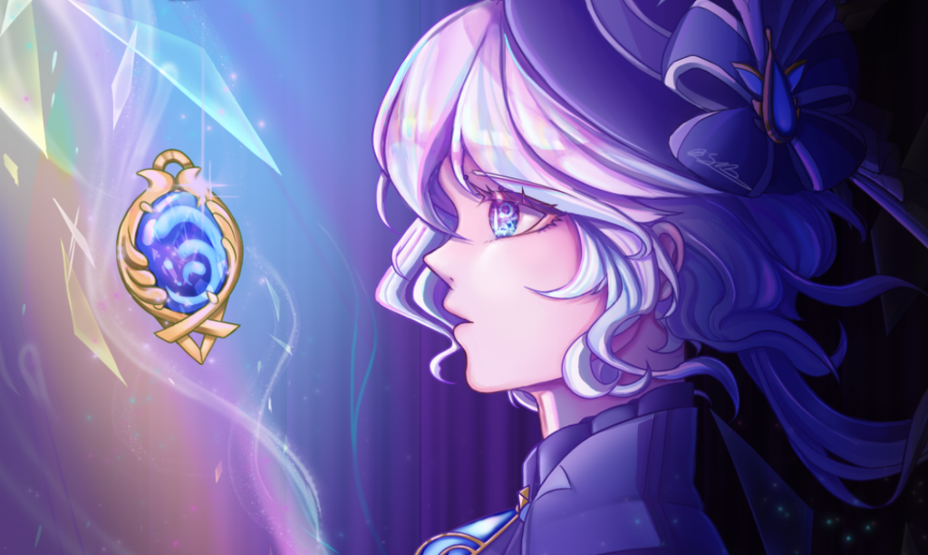
Something they both want Something in the form of a medal is what we want, We snatch for it, every time a person gets the item it changes into something they want e.g a key/pen
Snatch it back and forth before it breaks in half, We snatch our halves only to gain so little from it. The monsters arrives from the rubble and we fight off with the little power we have, Realising there is no way we could fend this off we decide to re unite the pieces. It becomes a massive key, both holding it we blast the monsters away. The sun comes up and we smile at each other finally uniting as one
At the beginning it could be competitive, could be trying to get something first, but breaking it makes it unwanted
8th of April 2024 The final piece to their souls they fight for it, when they place it in themselves it creates things they want, then it shatters picking up the pieces they share the broken pieces to complete themselves whole. A beam comes out to create the seal plushie.
Trapped in the bubble it bursts leaving them hurt. Seeing sister hurt she realises her sister matters more. Running to her aid she creates another forcefield. With their combined powers are able to push the creatures away
14th of April 2024
Monster tries to eat ka, pushes it away. I decide to run for her rescue and create the forcefield.
21st of April 2024
I create a monster. It attacks us, you me out of the way to save me get attacked real bad
In a moment of hesitation I look at the jewel as a bad thing. But as i look up to see you in trouble, i decide to come save you from the next attack
Aka make a forcefield
I can look down at the jewel and crack it to simulate SH but stop to realise its not helping the situation
24th of April 2024
When I kick my sister away, a photo flies out and I am unsure which to choose. Later when my sister gives me the stone I give her the photo for it, at this point it has a small tear.
Later when she gets attacked the photo gets ripped out and falls in front of me ripped right in half.