Initial Character Designs (For the Twins)

My concept starts with me and my twin sister in an different universe. I was initially going to have a younger and older version of the twins. The clothing is inspired by Chinese styled dresses and tech-wear found on Pinterest. These being so early on I should have done multiple sketches instead of just solo sketches of the characters to try to understand the characters than just being aesthetically good to look at.

The story consisted of the twins going through life in different rooms before meeting up as very different adults. I wanted adult designs originally to match this mature themes of Love and Unity. The reason this was scrapped is because me and my sister are not at the end of our adulthood in fact we are at the very beginning so using very adult characters doesn’t match us in the present. It would also be difficult to gauge the personality me or my sister would have as we grew older so I decided to age them down to make it easier for me to apply me and my sister to them now.

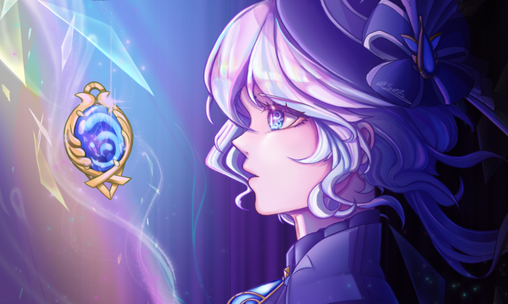
My first thoughts was to keep them looking as different as possible. So that the contrast from the younger versions are polar opposites at the end. This was scrapped because of time and cutting the story shorter to not include the younger versions of themselves. However, I still wanted to keep them looking different so they became more like contrasts of each other rather than the younger counterparts of themselves.

The designs themselves are very striking and detailed. These characters are opposites from one another because of the traditional look of the second character versus the right who is much more rugged and loose in their clothing style. In illustration these characters would work very well however, in animation these designs would not work at all.

For 2D hand drawn animation they are far too detailed and have too many aspects to their design to worry about when keeping it consistent throughout the animation process. There are many overlapping designs so their detail gets lost in the silhouette. I should have started with silhouettes and creating unique ones that match the characters personality. The young girl designs are very simple and effective due to them being literal copies of each other shows the twins motif well and the distinguished eyes let them stand out.

Animating and Editing my Scene (Sol and the Strange cat)

First WIP: https://youtu.be/g3RFO5XQZ98

Second WIP: https://youtu.be/6941fxwik48

Third WIP: https://youtu.be/eOzAfyblE1E

Fourth WIP: https://youtu.be/AZ33BUhuY9k

Final Video: https://youtu.be/GchBiXvgQ7o

Overall this process was normal except having to do colours separately because of the new technique I was doing. Due to doing a walking test recently I used a lot more arcs and anticipation which made the end product look much smoother. I did make a lot of errors in colouring but due to making multiple versions I was able to backtrack easily and regain any lost time I did lose initially.

Planning out the deadlines

The main way we planned was using an Edexcel sheet, a Gant chart and a scene list. Edexcel makes it easy and accessible for people and also easy to update progress with red for not done, orange for in progress and green for done.

A Gant chart is sideways bar chart that helps to plan out how long a task will take and its expected finish date. This kept us on track and focused and made sure deadlines were met.

The new addition was adding a scene list. This chart helps to visualize how complete each scene is splitting to roughs, keyframes, in-betweens and colour while also having editing added as well. This was a good addition as it made it easier to see I had initially too many scenes since I saw the amount my name was listed on the columns.

Final Animation

Overall Thoughts

Link to The Final Animation: https://www.youtube.com/watch?v=Ap0p5fTuWz4

(My Animated scene at: 0:33-0:54)

This whole project taught me a lot more skills moving forward. I pushed myself with editing and now I can do much more in After effects than I could do before. This project is a testament to myself to show I am capable of doing complex effects and techniques. The After effect technique that I used was track matting a pattern to a colour that was exported from Toon Boom which allowed for that moving pattern look on the final animation.

Although if there was more time I would have added more shadows to add dimension to the piece the shadows I did add (Which were added with using a lighter and darker coloured versions of characters and masking off the area where I wanted light to come through) the shadows that are there really do add dimension and it is enough to where I am satisfied with the outcome.

An effect I was very pleased with is the glow effect. I used this effect a long time ago but I remembered to use it because of the soul flame. This gave the room more ambiance and made the flame look more lifelike as it lit up the surroundings as well. I also used more masking when Sol gives his soul to the strange cat helping the audiences eyes to follow the light itself.

If I were to do this again I would have delegated more parts, since I was tasked with all the editing at the start and initially had 13 scenes out of 25 between three people (including me) however I was able to hand out some tasks to the other two so the output was much more even in the end, I am grateful for this team as they have listened and did well to keep up with deadlines and due to all our hard work was able to finish this animation at the very end.

(My Animated scene at: 0:33-0:54)

Link to The Final Animation: https://www.youtube.com/watch?v=Ap0p5fTuWz4

Animatics and Proof of Concept (In order) And Test Reels

Animatic one: https://www.youtube.com/watch?v=9mr7Ef8VHbw

Animatic two: https://www.youtube.com/watch?v=WHIBiH7sxBE

Animatic three: https://www.youtube.com/watch?v=NUWWBZM8wv8

Animatic four (WIP including the proof of Concept): https://www.youtube.com/watch?v=3vdHG7OWfv8

Test Reels: https://www.youtube.com/watch?v=AvqzhmvfBaQ

What changes?

Improvements

  • Added shots to make scenes more readable and clear
  • Music was added
  • Sound effects was added to when Sol falls and when he gets attacked.
  • A more fleshed out storyline revamps the initial animatic to have shots that will be featured in the final piece.
  • In Animatic four it features newly animated scenes that will be the final shots in the end animation.
  • proof of concept is added to show what style the whole animation will be in.

What could be improved?

  • Backgrounds could have been added earlier on
  • lighting suggestions could have been added to understand where light is in a scene

Overall Thoughts

Overall the Animatics showed how much more detail needed to be added to scenes since the first one is so simple it is difficult to tell where anything is in one shot. However, at the last animatic it is much clearer with a lot of shots cleaned up as well. One scene being the revival scene at Animatic four being flipped because it made more sense for Sol to be on the right as he just fell out of the box.

Thoughts on Proof of Concept

The Proof of Concept was simple and helped me practice the “Chowder” style technique in after effects. I am the editor in my group so in turn I did the editing of the whole proof of concept as well as the background for it too. This experience helped a lot when doing the rest of my scenes as it allowed me to animate while knowing what I could add to the piece in the end animation. For example I left out the colour spots in Harmony Toon Boom where the patterns would go and did them later on which made colouring a bit fragmented but rewarding nonetheless.

Thoughts on the Test reels

Since I made all of the tests (Excluding the whole of the proof of concept) I have learnt a lot from this project. From the new After effects technique, the multi plane effect in Toon Boom and new ways to learn how your character expresses themselves. It’s good to try out new things and I have gained a lot of new knowledge now that I can use in future projects as well.

Storyboards (All different types)

Initially we decided to create a posted notes storyboard. This was mainly for convenience since we were in the early stages and wanted to be able to cut and add any scenes needed to make the story more cohesive. This was a fairly quick task since we delegated one each and did them simultaneously while also having live feedback it helped to initially flesh out the story.

From this we created initial animatics too but the story became unclear towards the middle and end so we decided to create another storyboard to solidify what key scenes we were keeping from that initial storyboard. Firstly we made a text version while also visualizing the box that ended up becoming more like a treasure chest over time. This box would have a mountain of dolls in it that will scare Sol into leaving it.

With this new plan a beat sheet/new storyboard was created. This simulated the actual story of Sol reawakening after the maker has put a new heart into him. Below that is a more detailed look at the key beat shots that were to become vital parts of the story.

The posted note method is a new method for me and I cant say I dislike it however it does have flaws. This method can create confusion as scenes I created that ended up in the initial animatic were misconstrued and ended up being far more different than I imagined. I realized that in a team everyone has their own visions as to how this storyline will pan out, these storyboards is to help the whole team be on the same page and be aware of how the story will actually look like in the end.

Logline, Synopsis and Script (And story changes)

Initial logline:

An old, yet kind, dilapidated ragdoll is reanimated by The Maker, only to start giving away its bright soul to many other greedy fragmented dolls at the cost of it’s own.

Updated Logline:

An old, yet kind, dilapidated ragdoll is reanimated by The Maker. After coming across dolls on the brink of death, it restores their souls at the cost of its own.​

Old Synopsis:

The new ragdoll gets stitched up and placed with others who are in need of more light as they are pale in comparison. Once the ragdoll gives up its last piece of its soul. It flickers before dying with no light. A weasel comes and gives it some of its light. The ragdoll comes back to life at the end. 

New Synopsis:

Stitched and sewn back up, a new life is given to Sol. In that moment Sol decides because of this hardship they will pursue a life of kindness. Being placed in the care of the Maker’s makeshift nursery a swarm of wounded dolls crowd the bunny, crying desperate pleas for help. Sol, as kind as they are, has no reason to refuse, unaware of the true cost of their selflessness.

Why change?

The new changes to the story was because of the original being the initial idea we had where many dolls asked for permission. This was later scrapped because of time and the length of the animation to be roughly 50 seconds it just was not possible to have a montage of dolls to ask Sol and keep the story in a good pace. We also removed speech from the original script. This was to make it easier for the animators with no lip sync involved but this was mainly because there was no need for Oz to ask because Sol would be attacked instead so it would be rude for Oz to question Sol after what he had just gone through.

Backgrounds (Mood-boards and Backgrounds I created)

The main idea of our backgrounds was photo bashing. This is when you take real life photos and merge them into one image. Taking images from real life I created the Table leg and floor backdrop for the proof of concept made later on.

There was a lot of difficulties behind the tower of dolls background. Initially I was going to keep it a simple background that would move with the character. However after learning multi-plane on Harmony Toon Boom (Which includes turning assets into 3D and placing them in different planes on the screen) it was possible to create a parallax effect in Toon Boom. Parallax is when an object looks different when viewed at a different angle, so to achieve this I separated the dolls, the wall and the floor to achieve this differing angle effect in the end animation.

I also created a textured overlay, this would help to mesh the animation which is very smooth looking to the more textured backdrop, I decided to use after effects blending mode multiply as it gave the effect I wanted and helped the scene to not feel so clean and more vintage.

Strange cat Development and Final Stages

This cat created itself through the animatic. In the initial animatic we had drawn a vague cat like creature grabbing and trying to rip Sol apart. This was all I could go off when creating this cat.

To keep the character relatively simple to animate I created a half and half personality. In my previous animation “Duality” I favor creating dual personalities within characters I create. In this example the left half of the cat looks more innocent and doll like while the right is a menacing empty shell that is disturbing at best. This dual personality character is what tricks the protagonist Sol into helping him and using the right camera angles will deceive the viewer as well.

Overall his design is fit for his usage in the animation, however it could be argued this design is not very animator friendly as the hole in his stomach is very inconsistent and has no real pattern when having to recreate it many times. Another issue is the interlocking patterns are bit difficult to keep up with and can be easily confused with one another since the colours are so similar in tone. Next time it would be beneficial to use a grey background when colouring so I can focus on tone that can stand out on many backgrounds. I should also make sure the character is easily repeatable with the stomach being a more simple rounded hole than a jagged mess for animators.

Oz Initial/Development and Final stages

Oz was always going to be a ferret. In this phase there should have been more development for the type of symbolism behind the secondary leads animal but the initial idea was that ferrets are cunning and strong minded so it made for a very confident second lead. Oz wears a proud top hat with a cane helping him stand over most other plushies.

The reason I chose plaid/flannel for his pattern was because his design is meant to be reminiscent of prestigious toys at Christmas that have flannel in their bear toys. However this backfired since it made him look much more bear like which ended up being an issue when colouring. Secondly flannel is associated a lot with the west and lumberjacks not exactly prestigious but in this case it worked out in the end.

In his final design his hat was made to look even larger, this was because it was too reminiscent of a character from a horror game franchise so it separate them more I opted to extending his hat.

I used an Albino ferret for the reference of the colouring. This design choice worked well for this character since he is a proud ferret the white coat looks upkept and prestigious unlike Sol which is much more dilapidated. The white coat stands out too from other dolls that will be appearing in the animation later on. Originally he was meant to be twice the height of Sol but when we put them side by side it was apparent that was too small so we made Sol be 2/3 of the height of Oz.

Overall Oz is a good character however there could have been more thought behind the type of animal chosen as well as the main colour associations with him since flannel again could be substituted for a more premium texture but even with these flaws Oz still stands out well in the final animation.